Unveiling the Mystery of Box and Whisker Plots: Decoding the 5-Number Summary
Introduction
Data visualization is a crucial aspect of understanding and interpreting information. When it comes to showcasing the distribution of data, few tools are as effective and insightful as box and whisker plots. These visual representations provide a compact yet comprehensive view of your data, making it easier to identify trends, outliers, and central tendencies. In this article, we’re going to take you on a journey through the world of box and whisker plots, unraveling the secrets behind the 5-number summary and how it empowers you to extract valuable insights from your data.
The Basics of Box and Whisker Plots:
A box plot summarizes data using the median, upper and lower quartiles, and the extreme (least and greatest) values. It allows you to see important characteristics of the data at a glance.

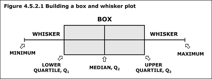
Imagine you have a dataset containing a wide range of values. A box and whisker plot, often called a box plot, is a graphical representation that provides a clear snapshot of the distribution of your data. The plot consists of a rectangular box and two lines (whiskers) extending from either side.
The box is divided into four parts by the median or the middle value of the dataset. The whiskers extend from the box to the minimum and maximum values. This visual arrangement highlights the variability, symmetry, and central tendency of your data.

The 5 Number Summary
The five-number summary is another name for the visual representation of the box and whisker plot.
The five-number summary consists of :
1-> The median ( 2nd quartile)
2-> The 1st quartile
3-> The 3rd quartile
4-> The maximum value in a data set
5-> The minimum value in a data set
- Minimum: The smallest value in your dataset, representing the lower extreme.
- First Quartile (Q1): The median of the lower half of your data, indicating the 25th percentile.
- Median (Q2): The middle value, showcasing the center of your data.
- Third Quartile (Q3): The median of the upper half of your data, representing the 75th percentile.
- Maximum: The largest value in your dataset, depicting the upper extreme.
Constructing a box and whisker plot
Step 1 — take the set of numbers given…
34, 18, 100, 27, 54, 52, 93, 59, 61, 87, 68, 85, 78, 82, 91
Place the numbers in order from least to greatest:
18, 27, 34, 52, 54, 59, 61, 68, 78, 82, 85, 87, 91, 93, 100
• Step 2 — Find the median.
• Remember, the median is the middle value in a data set.
18, 27, 34, 52, 54, 59, 61, 68, 78, 82, 85, 87, 91, 93, 100
68 is the median of this data set.
Step 3 — Find the lower quartile.
• The lower quartile is the median of the data set to the left of 68.
(18, 27, 34, 52, 54, 59, 61,) 68, 78, 82, 85, 87, 91, 93, 100
52 is the lower quartile
Step 4 — Find the upper quartile.
• The upper quartile is the median of the data set to the right of 68.
18, 27, 34, 52, 54, 59, 61, 68, (78, 82, 85, 87, 91, 93, 100)
87 is the upper quartile
Step 5 — Find the maximum and minimum values in the set.
• The maximum is the greatest value in the data set.
• The minimum is the least value in the data set.
18, 27, 34, 52, 54, 59, 61, 68, 78, 82, 85, 87, 91, 93, 100
18 is the minimum and 100 is the maximum.
Step 5 — Find the inter-quartile range (IQR).
• The inter-quartile (IQR) range is the difference between the upper and lower quartiles.
Upper Quartile = 87
Lower Quartile = 52
87–52 = 35
35 = IQR
The 5 Number Summary
Organize the 5-number summary
Median — 68
Lower Quartile — 52
Upper Quartile — 87
Max — 100
Min — 18
Conclusion:
In the realm of data analysis and visualization, box and whisker plots stand out as a dynamic and informative tool. By embracing the 5-number summary, you gain a deeper understanding of your dataset’s distribution and can identify key characteristics such as central tendencies, variability, and outliers. With these insights at your fingertips, you’re empowered to make informed decisions and unlock the potential hidden within your data.
So, the next time you encounter a dataset, consider harnessing the power of box and whisker plots to reveal its hidden stories. Your journey into the world of data visualization has just taken a fascinating turn — one that promises to enrich your analytical toolkit and transform the way you interpret information.
Thanks for being a part of our community! Before you go:
- 👏 Clap for the story and follow the author 👉
- 🔔 Follow us: LinkedIn
